Data Usage Platform (DUP)
Data explorer that shows how federal data is being used in the real world.
Overview
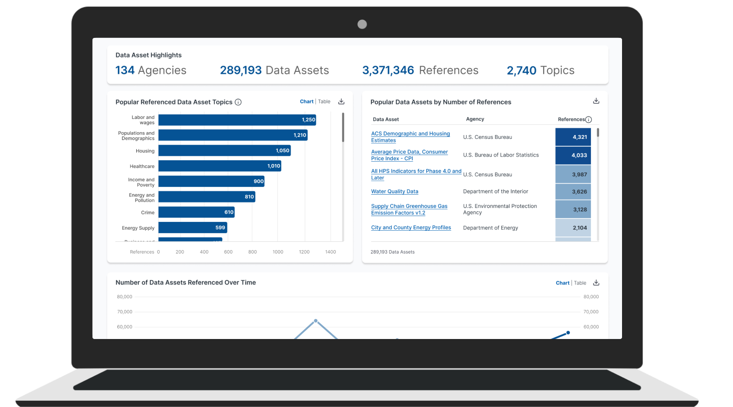
The DUP collects “usage signals” for federal data assets and presents them in a responsive dashboard. I led discovery and research, shaped product strategy, and co-led design and testing. The homepage became the key entry point that clearly and quickly explained the vision.
Client
National Center for Science and Engineering Statistics (NCSES)
Role & Duration
2023-2025
The Problem
Federal agencies publish many datasets, but there hasn’t been an easy way to see how they’re used in the real world. Early usage dashboards had scale and metadata issues and unclear purpose. DUP needed to unify sources, explain it’s a usage explorer (not a repository), and provide a reusable blueprint.
Role & Process
I aligned policy goals with user needs and led 50+ research sessions across audiences. We co-designed navigation, iterated wireframes, and built data-connected prototypes. Three rounds of moderated usability tests improved labeling, content priority, and component behavior.
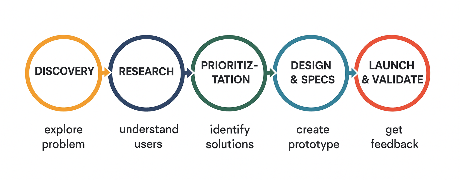
User-centered design approach utilized for the DUP project.
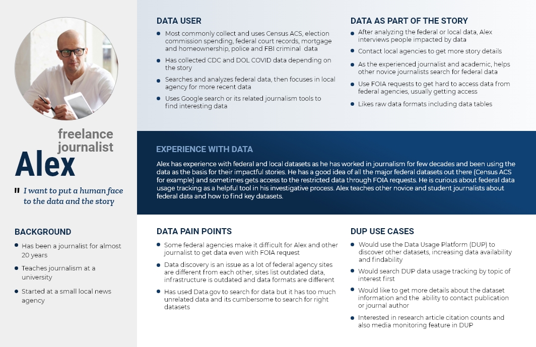
Research Insights
New users expected raw datasets, not insights about usage, so we added plain‑language orientation and examples. People cared most about findability—topic entry points, consistent names/aliases, and clear filters. Trust depended on context: citations, links to sources, and a “Confirmed Use” indicator that distinguished casual mentions from real analytical use.

“In an agency when they’re producing data, they’ve be interested in tracking who is accessing and what they’re accessing to get a sense of our reproducing information that’s meaningful and useful”
– Federal agency research analyst

“Some agencies do not want to share public data. And sometimes we have legal access issues to get data from agencies”
– Freelance journalist

“Data media mentions are more helpful because it indicates more discussion in a real world practical case…”
– State Chief Data Officer
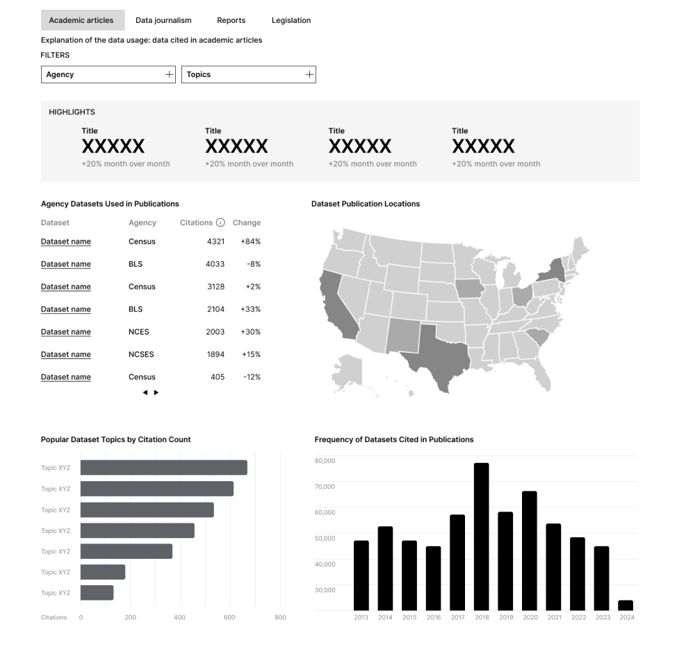
Design Solutions
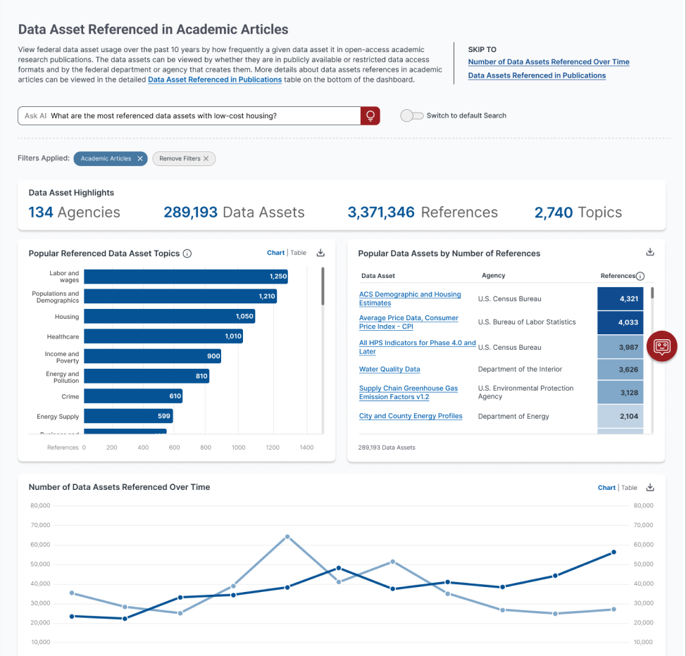
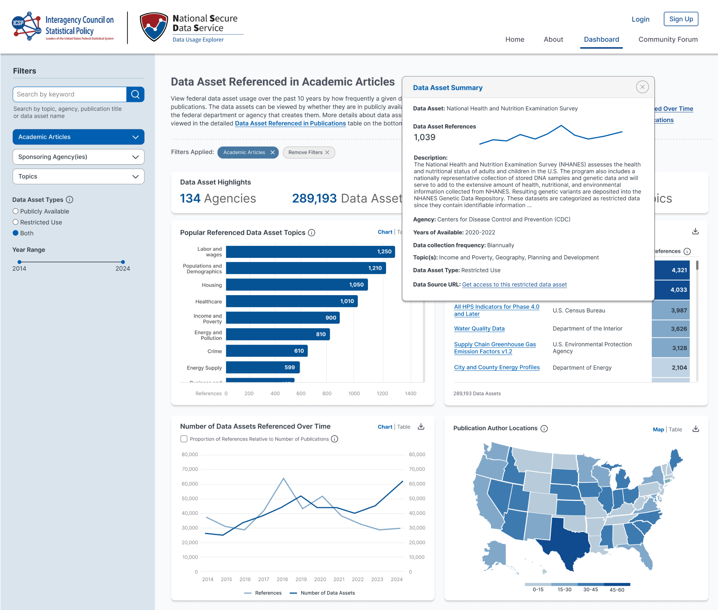
An updated homepage that provides clear purpose and direction; a modular dashboard that pivots by topic, source type, agency, and time; pop‑ups for citations and metadata; asset detail pages with standardized names and a ”Confirmed Use” badge; a lightweight community module for user stories; and a documented, accessible design system for reuse.
AI-integration Enhancements
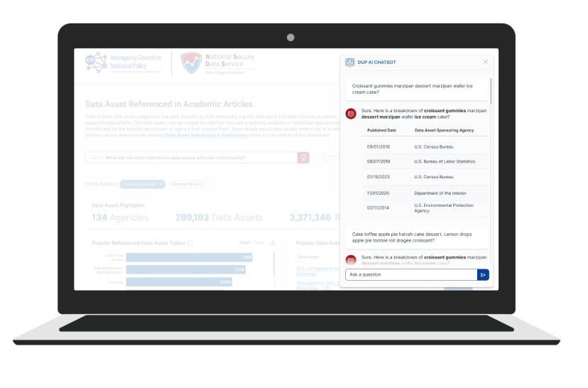
We explored a conversational assistant blending structured queries (e.g., “top referenced assets in 2016”) with semantic search (e.g., “resources related to farming”) to help non-experts ask questions naturally.
Outcomes
Testing showed faster comprehension and smoother task starts. Agencies used usage data to guide decisions, and trust increased thanks to visible citations and source links. A comms kit and technical docs supported adoption and reuse.
Usability Test Results
24
Tests
93%
Success Rate
86sec
Time on Task
4.29
Avg. SUS
Project Learnings
Clear orientation reduces false starts; consistent naming and filters drive discoverability; visible citations increase trust; and documenting a design system accelerates reuse.
Let’s Connect
Feel free to reach out for collaborations or just a friendly hello