Modernizing federal evidence
review platform
Home Visiting Evidence of Effectiveness
Overview
Home Visiting Evidence of Effectiveness (HomVEE) is the national source of truth for determining which home visiting programs are evidence-based, developed for OPRE, a federal government division within HHS. Policymakers use it to make funding decisions, researchers use it to validate studies and implementers use it to choose programs that affect real families.
When I joined the project, HomVEE was trusted, yet hard to use. My goal was to turn a dense, policy-heavy system into a product users could easily understand, trust, and act on, without diluting the rigor behind the evidence.
Role & Duration
2023-2026
Impact at a glance
The redesign led to faster comprehension, smoother task starts, and higher confidence in comparing models. Usability testing showed clearer orientation, fewer navigation errors, and quicker time-to-decision. For OPRE, the redesign created a scalable, modern foundation that supports future content, analytics, and long-term adoption.
2x
Engagement in
critical content
↑14%
Research page
access
↑39%
Returning Users
↑36%
Navigation errors
The Problem
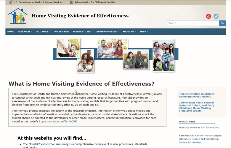
HomVEE website felt like a repository, not a product. Based on the Google Analytics data, users often arrived through keyword search to a single page, struggled to orient themselves, and left unsure if they had the right answer. Key concepts were buried behind acronyms. Comparing models required mental gymnastics across multiple pages. The visual design reinforced this friction as it was text-heavy, dated, and offered little guidance.
The challenge wasn’t lack of content. It was a lack of clarity.
Key Issues
- Users struggled to orient themselves and often started tasks on the wrong page.
- Key evidence details were scattered across pages, increasing cognitive load.
- Comparing models required memorizing information instead of supporting decisions.
My Role
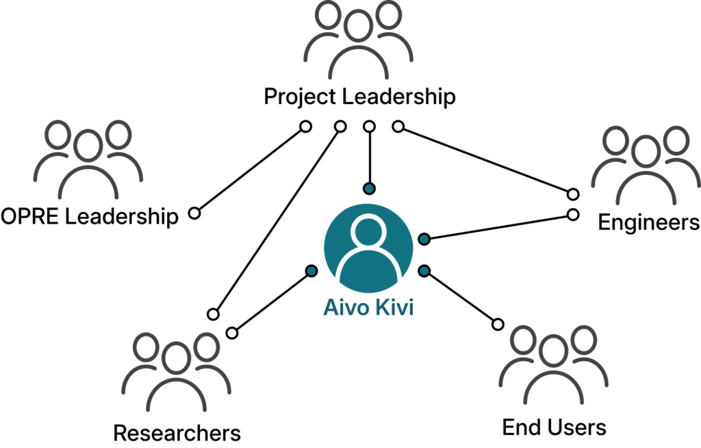
I served as the lead UX designer and product partner for HomVEE, working closely with the client (OPRE) leadership, researchers, engineers, and content authors to navigate technical constraints while advocating for user clarity. Much of my role involved facilitating alignment; using sketches, prototypes, and testing results to help stakeholders make informed tradeoffs between accuracy, governance, and usability. I also supported the art director with site branding and style guide creation, aligning client and engineering expectations with modern visual storytelling.
Team
My Responsibilities
Strategy
- Solution framing and experience vision
- Information architecture (IA) and interaction design (IxD)
- Cross-functional design reviews and alignment
Delivery
- Iterative prototyping from low to high fidelity in Figma
- Iterative moderated remote usability testing
- Design handoff and collaboration with Drupal developers
Design Intent
How do we help users feel confident they’re making the right decision,
quickly and without second-guessing?
That question shaped every decision: explaining context before asking users to explore, making evidence scannable rather than intimidating, supporting comparison instead of memory, and clearly signaling where users were, what mattered, and what to do next.
Research Insights
Initial Tests – Shaping the foundation
We began by testing the existing HomVEE website with a small set of representative users to understand where and why the experience was breaking down. These moderated, task-based sessions focused on core actions, finding research, understanding strength of evidence, and navigating between related pages.
Users consistently struggled to orient themselves, hesitated around terminology, and relied on trial-and-error navigation. This initial testing helped align stakeholders around a shared understanding: the problem wasn’t the evidence, it was how it was presented.
Key Research Insights
Urgent goals, slow progress
Users arrived with specific questions but were slowed by unclear hierarchy, forcing rereads, backtracking, and second‑guessing.
“I know what I’m looking for, but I keep stopping to figure out where I should even start.”
Structure broke the mental model
Information was fragmented across pages, making it hard for users to predict where content lived or how pieces connected.
“I feel like I’m jumping around instead of moving forward”
Comparison was unsupported
Users naturally compared models, but had to remember details across pages, increasing cognitive load.
“I’m trying to click back to see if I missed anything.”
Acronyms hid meaning
Domain-specific acronyms lacked context, leading users to make incorrect assumptions about eligibility and evidence.
“I’m familiar with these programs, but I’m not always sure what this means without digging.”
Goals for redesign
Iterative testing of the redesigned experience
As the design evolved, we ran two additional rounds of moderated usability testing with 12+ participants across researchers, federal staff, and state and tribal implementers. We tested low- to high-fidelity prototypes to validate structure, navigation, and clarity before moving into development.
By the final round, testing showed measurable improvements with higher task success rates (71% → 92%) for finding eligible models and key evidence indicators, fewer navigation errors and wrong-page visits during tasks, and finally, faster time-to-decision when comparing models side by side.
Homepage improvements
- Using less content to show more visibility into site structure and navigation
- Explanation of what is available, including less-visible minority population research
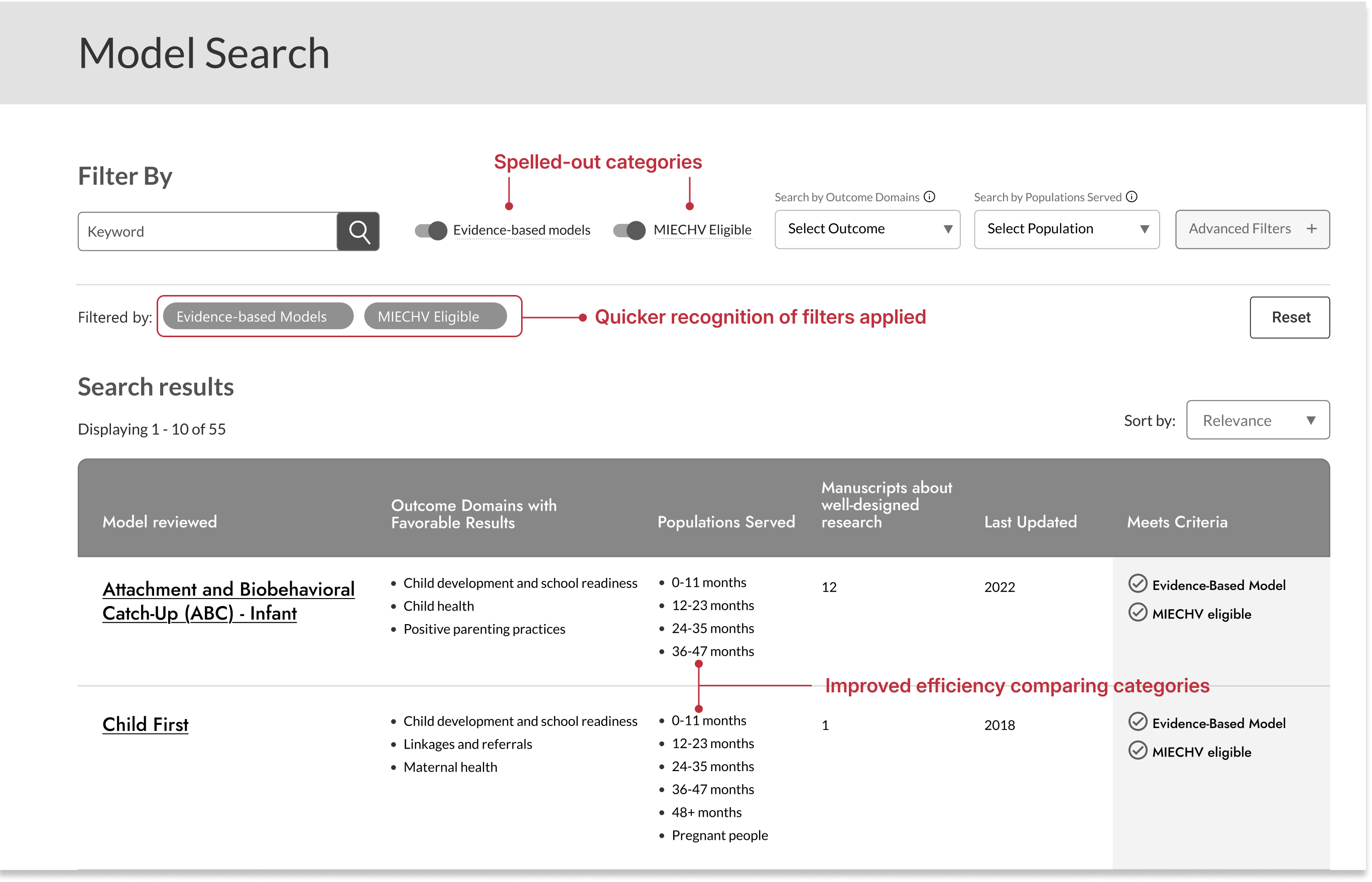
Search improvements
- Easier recognition of domain categories
- Increased transparency with interactive tasks and filters
- Faster time to compare data across research
- Improved heuristics; showing progress and changes applied
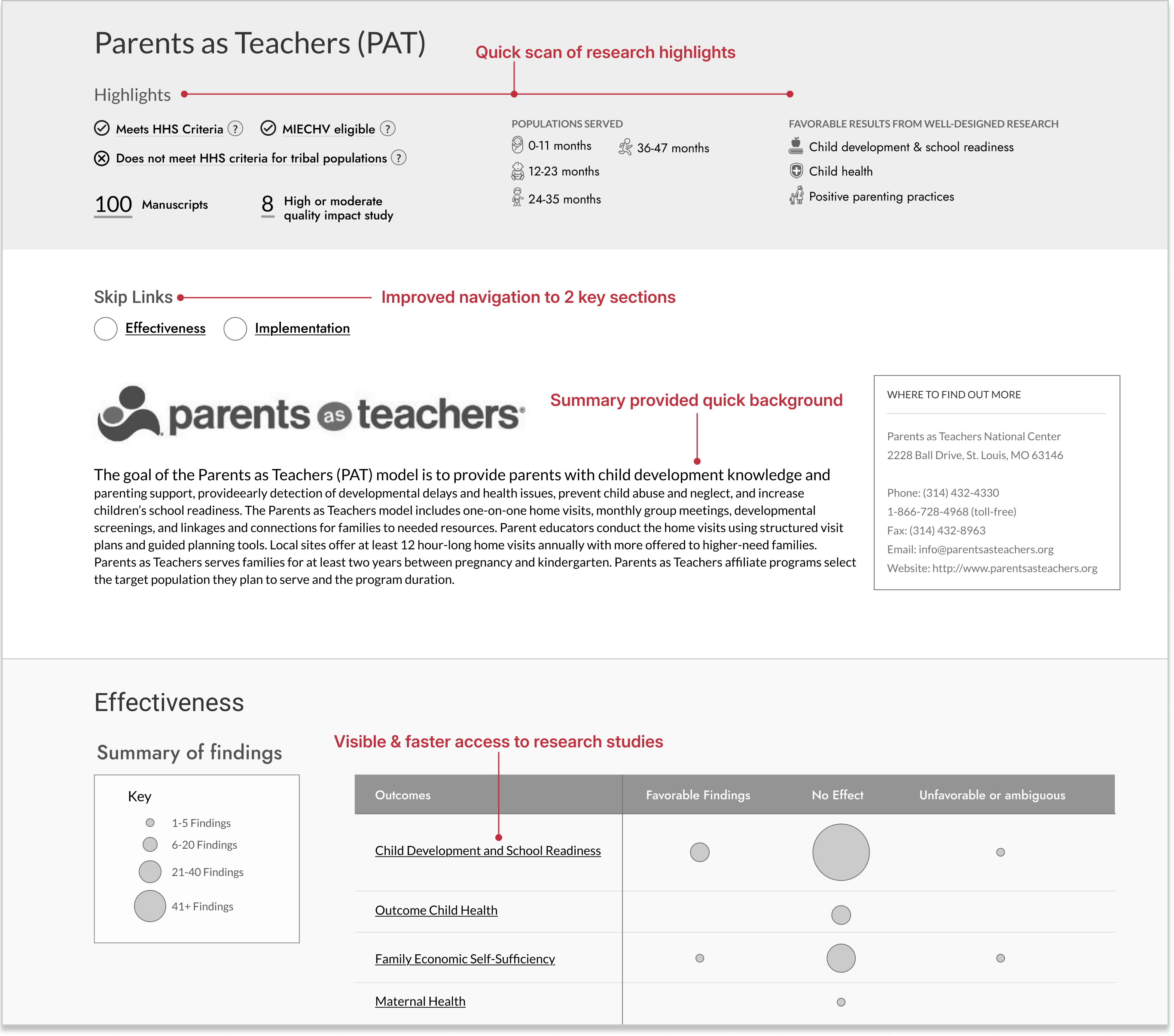
Research Model improvements
- Users were able to review highlighted and summarized content before exploring further
- More visible sections easier to navigate, even with longer content-heavy pages
- Visually more easier to recognize what outcomes worked, what didn’t
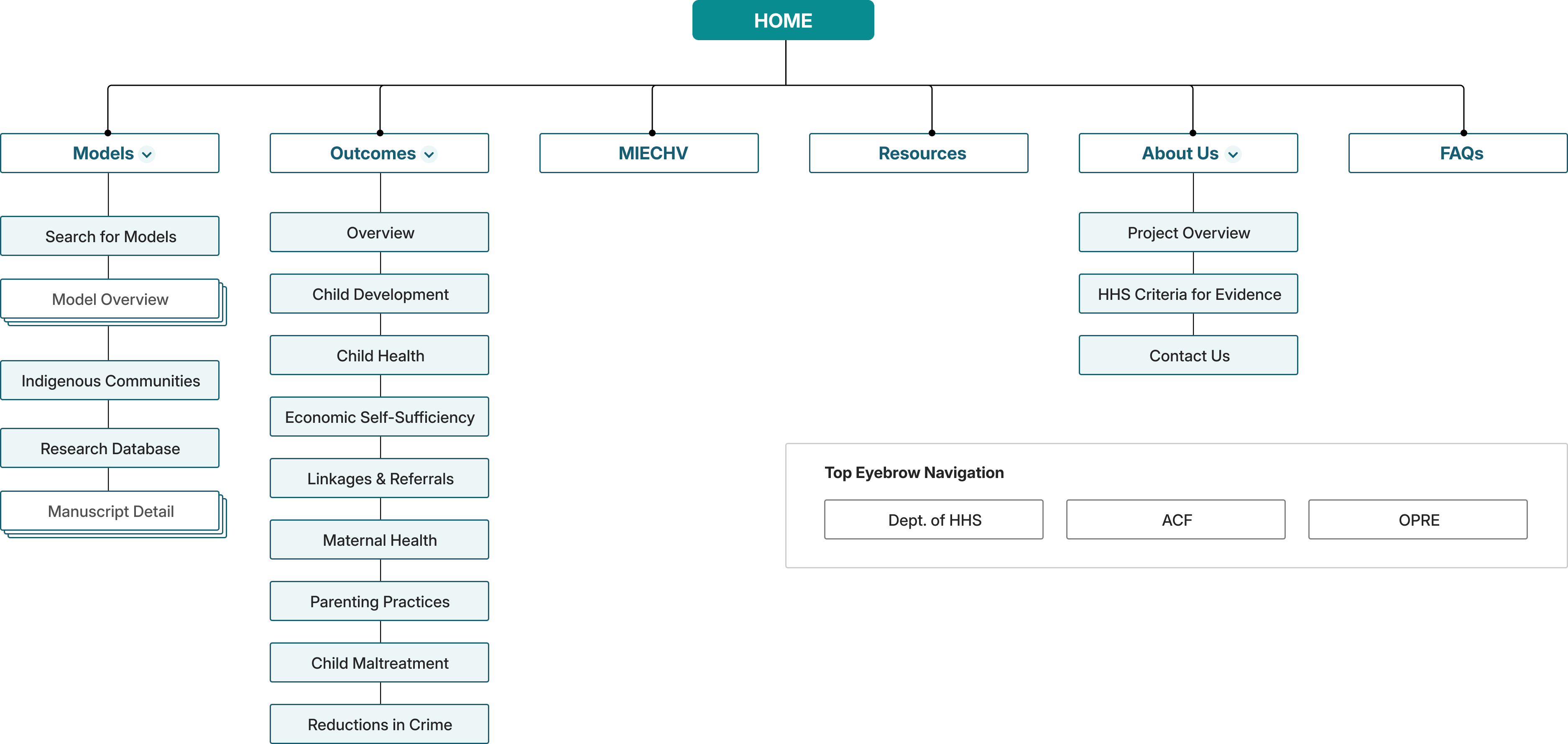
Information Architecture
In parallel, I led information architecture (IA) evaluations using card sorting and tree testing with additional participants. These exercises revealed where navigation labels caused hesitation, where content felt duplicated, and where users instinctively looked for answers. The results directly shaped the navigation hierarchy and supported a major decision to consolidate fragmented model pages into a single, cohesive experience.
IA test findings
Tree Testing
- 30% error rate for hard-to-find pages
- Unclear terms confused participants
- Overly complex nav menu created dead-ends
- Similar topic names led to confusion
First-click testing
- 30% error rate for hard-to-find pages
- Unclear terms confused participants
- Overly complex nav menu created dead-ends
- Similar topic names led to confusion
This testing wasn’t just about usability, it was about trust. For stakeholders at OPRE, it reduced risk by showing that design decisions were evidence‑based. For users, it meant fewer wrong turns, less second‑guessing, and a clearer path from question to decision.
Navigation Improvements
By the time we moved into high‑fidelity design, the structure was no longer theoretical. It had been pressure‑tested by real users making real choices, exactly the confidence a product like HomVEE requires.
70%
Success Rate for Unambiguous
Labels after updates
52 → 90%
Usability Testing Task Success Rate After IA restructure
71 → 92%
Directness Scores with users finding correct navigations without backtracking
Design Solutions
Rather than layering features on top of an old structure, I focused on a small set of connected solutions that worked together to reduce cognitive load and build confidence.
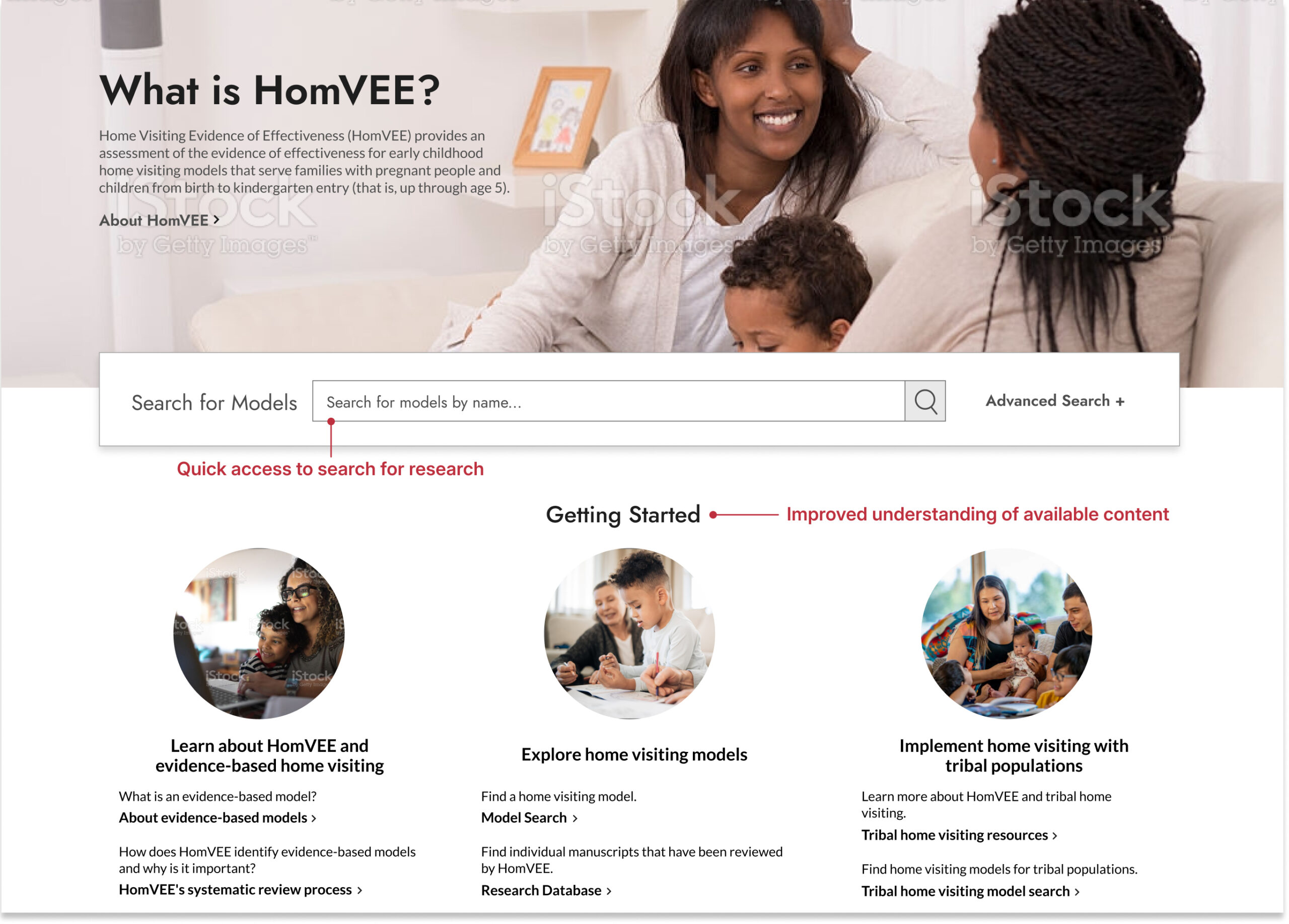
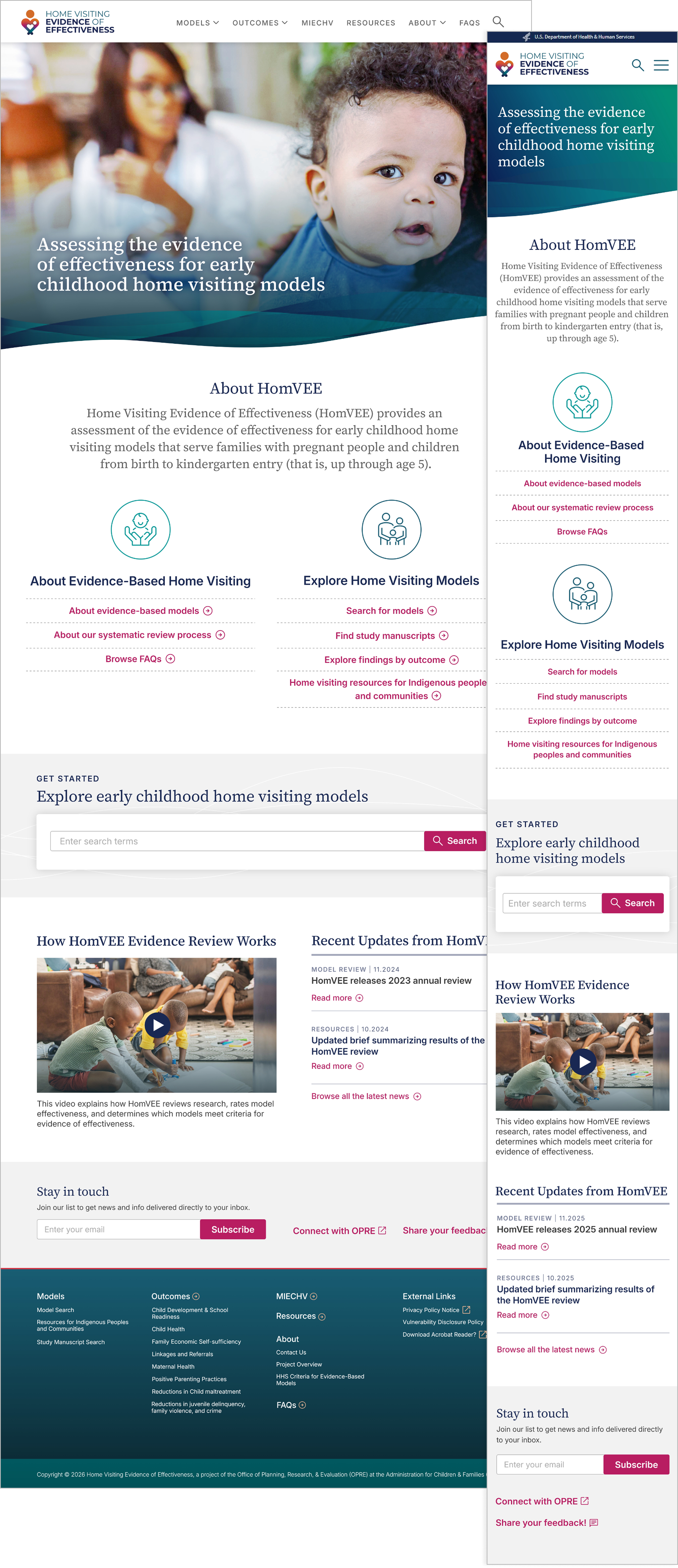
A homepage that orients, not overwhelms
The homepage now clearly communicates purpose, audience, and next steps, with quick paths that help users begin without reading everything.
Outcomes
Testing showed faster task starts and improved first-click accuracy when locating relevant models.
Search that adapts to user behavior
Search was simplified with faceted filters, visible filter states, and clearer language, supporting exploration instead of requiring prior system knowledge.
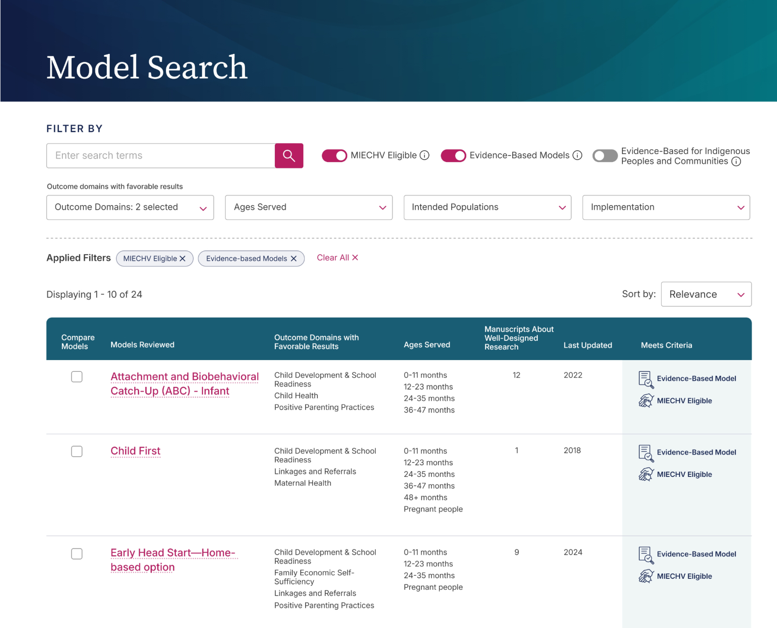
Outcomes
Users located eligible models faster, with fewer navigation errors and reduced filter confusion during usability testing.
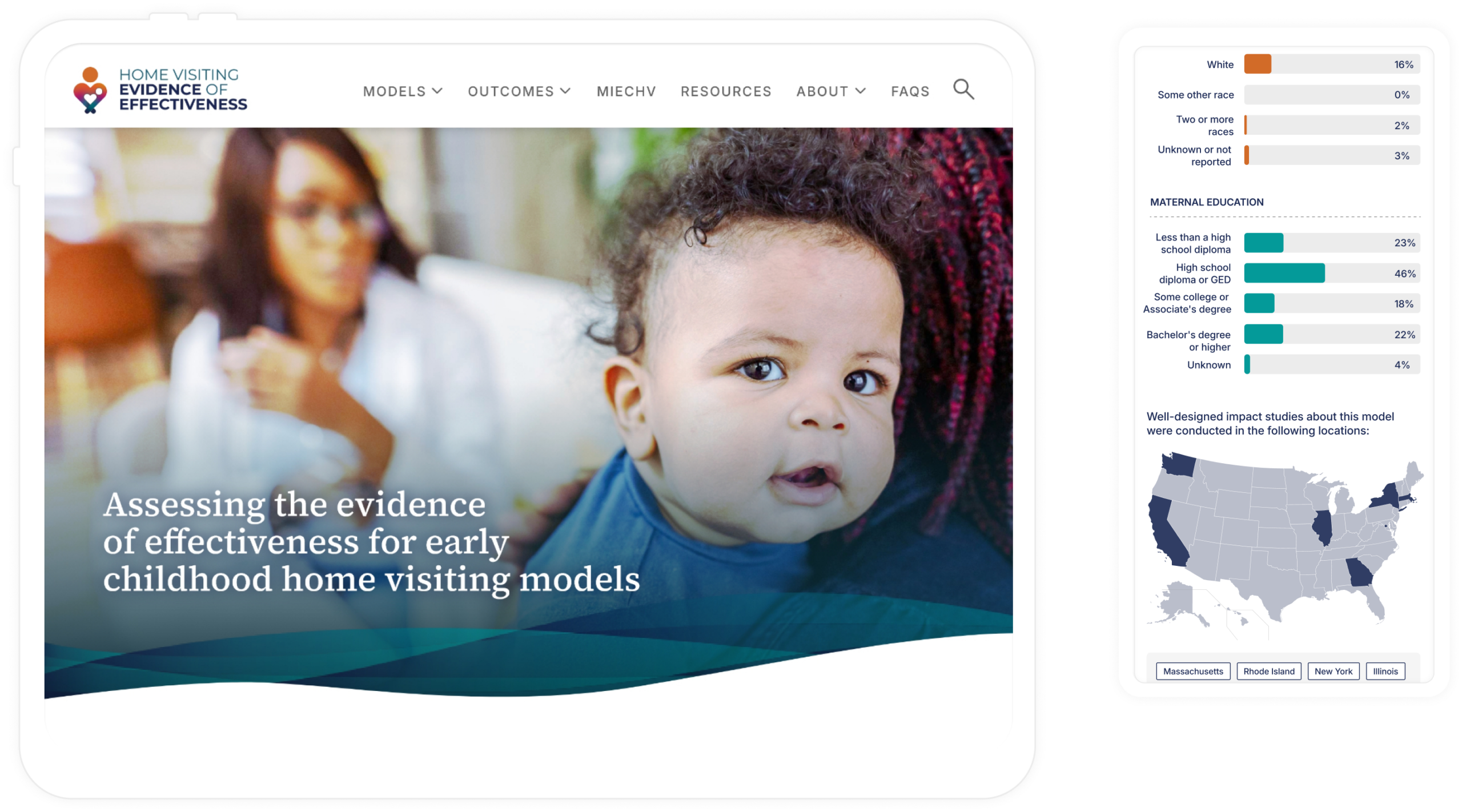
A single, cohesive model experience
Model content was unified into one clear flow. A visual summary surfaces eligibility, populations served, and evidence strength first, allowing users to go deeper only when needed.
Outcomes
Reduced backtracking and improved task success rates when evaluating eligibility and evidence criteria.
Comparison as a first‑class interaction
The Compare Models feature enables side‑by‑side evaluation, turning evidence review into a tangible decision moment.
Outcomes
Shortened time-to-decision and increased user confidence when comparing similar models side by side.
Visual cues that explain complex concepts
Icons, hover definitions, and lightweight signals clarify ideas like evidence‑based status and MIECHV eligibility without adding clutter.
Outcomes
- Modernized branding and style for the domain
- Decreased time to complete tasks for users
- Decreased time to develop new features
Outcomes
The redesigned HomVEE delivered meaningful improvements for both users and stakeholders. In later-stage usability testing, participants completed key tasks faster, made fewer navigation errors, and expressed higher confidence when comparing models. Side-by-side comparison reduced cognitive load and shortened time-to-decision.
page engagement
2x
More users finding and engaging with lower performing effectiveness pages, aligning with client’s goals.
access to research
↑14%
Increased research page views with higher engagement and improved navigation from model pages.
returning users
↑39%
Increased returning users with improved user experience and ease of navigation.
navigation errors
↓36%
Less errors and misclicks during user feedback and usability testing for faster access to content.
For the client, the redesign established a scalable product foundation, supporting clearer content governance, future tagging, and analytics. Internally, stakeholders reported greater confidence sharing HomVEE with partners and agencies. Externally, the site now functions as a decision-support tool rather than a static evidence repository.
“I no longer have to piece information together across pages, and I feel more confident sharing these findings with stakeholders. It’s a meaningful improvement over the previous site.”
– Federal program analyst
Project Learnings
Design within constraints
Federal systems come with fixed definitions, compliance rules, and policy realities. Strong product design isn’t about removing constraints, but it’s about knowing where to push for clarity and where to respect the system.
Clarity builds trust
When users understand what they’re seeing, they stop second‑guessing the data. That clarity turns hesitation into confidence and enables faster, better decisions.
Empathy makes complexity usable
This work wasn’t about simplifying evidence, it was about respecting users enough to guide them through complexity. Thoughtful structure and pacing made dense information approachable and actionable.